Results from the course “Paul Klee and vector fields”
The artist Paul Klee describes and analyzes his use of symbols and colors in his book “Pädagogisches Skizzenbuch” (pedagogical sketchbook, 1925). He uses arrows for means of illustrations and also discusses the arrow itself as an element of his repertoire of symbols. Interestingly, his point of view on arrows matches the way in which vector fields are represented graphically. Based on this connection of mathematics and Klee’s artwork, Henriette Lipschütz and myself developed a concept for a summer school course for gifted high-school students. Its aim was both to introduce the participants to higher-level mathematics and to let them create their own piece of artwork related to the art of Paul Klee and vector fields. This homepage presents the artistic results of the participants. The texsts below the artworks are statements of the respective artists, translated from German by Henriette Lipschütz and myself.
Ohne Titel (No Title)
Albert Kniazev
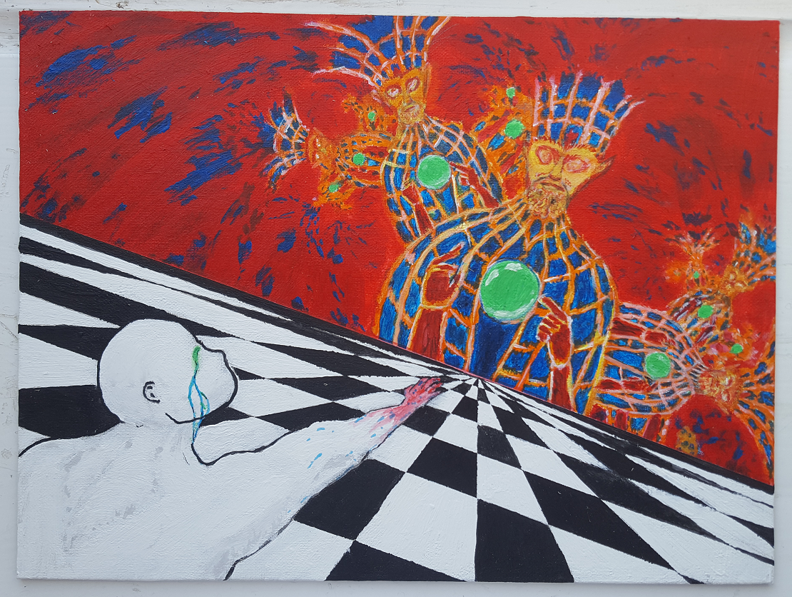
Acrylic on canvas, 30cm x 40cm, 2019.
The aim of the project is to depict the unattainability of heaven respectively of perfection of man. The work is inspired on the one hand by a talk on the “Pädagogisches Skizzenbuch” by Paul Klee which defines the arrow as symbol for the mentioned motif and by fractals on the other hand.
The painting contains a sloping horizon with an vanishing point to which a checkerboard pattern runs. Above the vanishing point, a being arises which is inspired by the painting “Cosmic Christ” by Alex Grey. The area above the horizon is colored. Together with the being, this symbolizes on one hand heaven and on the other hand a kind of epiphany. In the opposite corner an `empty' human is located which looks like a white mannequin. The mannequin is reaching greedily respectively longingly in direction of the vanishing point. The human is illuminated colorfully from the horizon and has a colorful sparkle his eyes. The black-and-white side of the human forms a contrast to the colorful side of the being.
From each right shoulder and from each left side of the being at the horizon a smaller copy of the being arises. Therefore, these beings form a fractal.
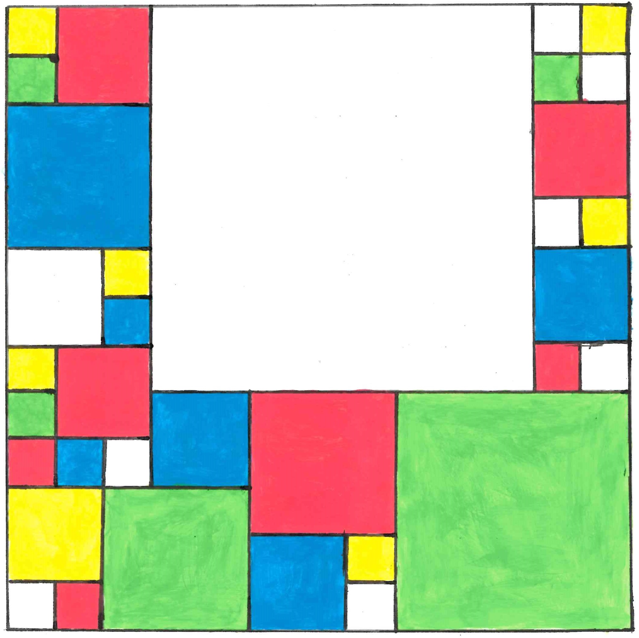
Unregelmäßige Harmonie (Irregular Harmony)
Anjali George
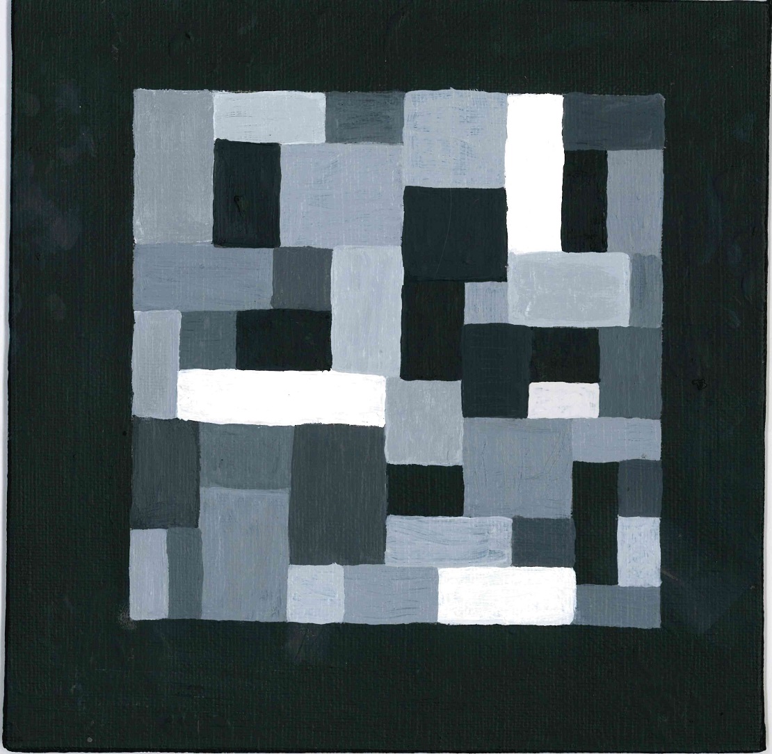
Acrylic on canvas, 20cm x 20cm, 2019.
At the time of the Bauhaus (1919--1933), the aspect of harmony was an important part of art. The chessboard pattern is a typical example of a regular distribution of elements as described in Paul Klee's theory of form. Since the irregularity of the chessboard pattern appears to be too easy, it was a challenge to create a pattern which is irregular, but also balanced at the same time.
The picture was painted with acrylic paint on a 20cm✕20cm canvas and presents an irregular distribution of rectangles which fill out a square. All sides of the rectangles are pairwise collinear, parallel, or orthogonal.
Ephemeros 1–4
Anna Dorner
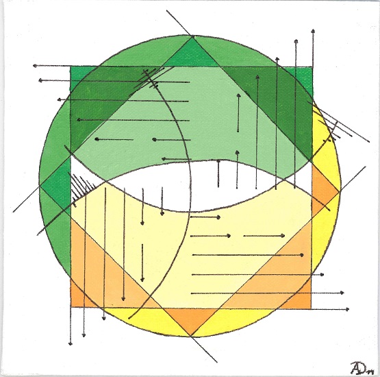
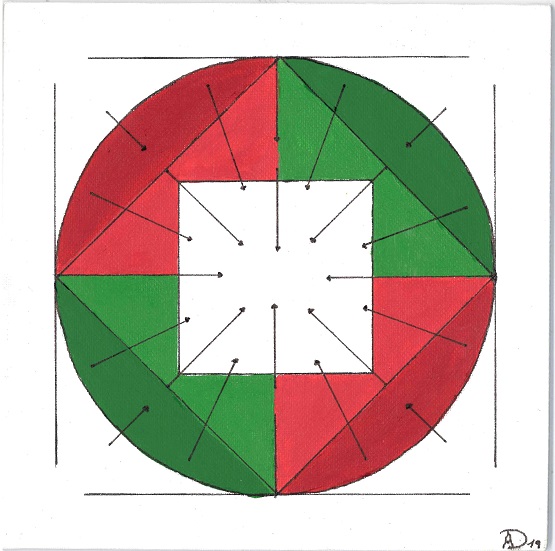

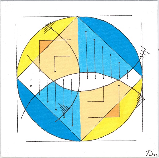
Acrylic on Canvas, 20cm x 20cm each, 2019.
The project “Ephemeros 1--4” is a series of four paintings. The series picks up several mathematical notions such as vectors, vector fields, curl, divergence, and norms. This is accentuated through the reoccurring use of arrows as they can also be found in Paul Klee's paintings. The arrows concurrently act as a symbol and represent vectors. The paintings are painted on 20cm✕20cm canvas with acrylic paint and black felt-tip. There is no brushwork visible. Because of the high number of geometric forms the paintings appear to be constructed and abstract.
The series also reflects Paul Klee's intentions. As in his paintings, the arrows create energy and provide a direction respectively point to a goal human beings are longing for. Still, humans will never reach it. This emphasizes the longing of human beings, who try to reach the unattainable, as well as the “human tragedy”. In the series, this is intensified by rotating arrows as well as by the divergence-free vector field—everything is turning in a circle, no end is in sight. In contrast, the colorful and bright colors arouse positive feelings in the observer. The paintings appear—for instance because of the balanced colors—harmonious and consistent. No color is dominating the others. This can be recognized in the vectors, too. They are in balance of forces, no vector is following its direction stronger than the others.
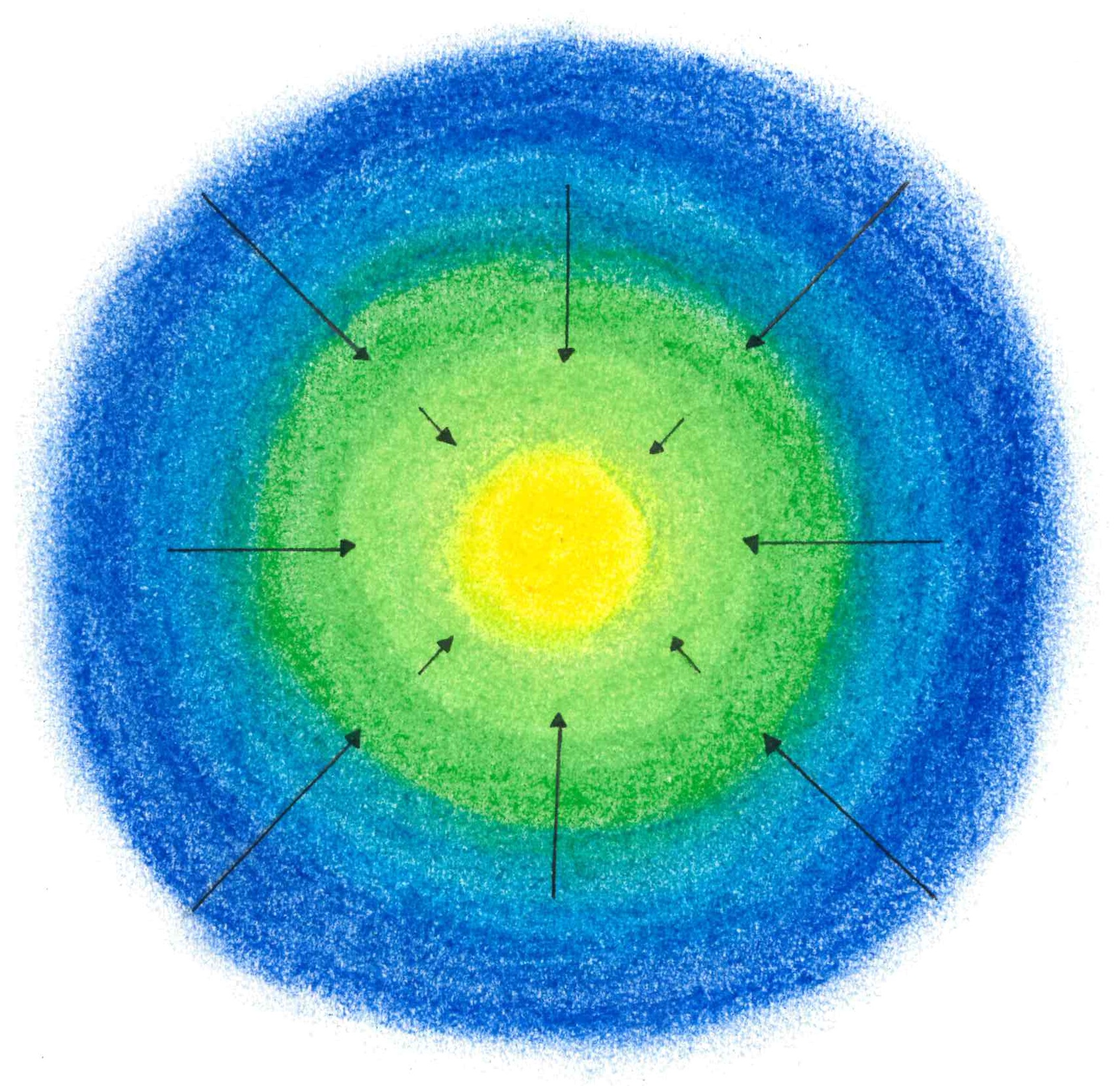
Flug der Pfeile. Serie in Blau, Grün und Gelb. (Flight of the Arrows. Series in blue, green, and yellow.)
Birgit Zickler
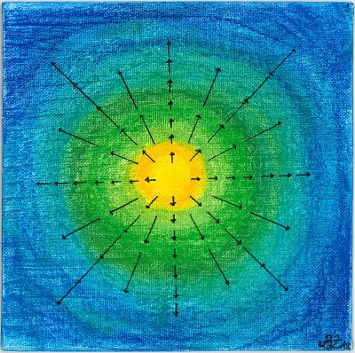
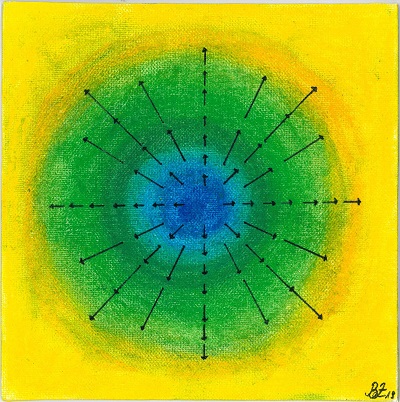
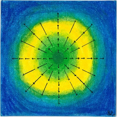
Pastel on Canvas, 20cm x 20cm each, 2019.
The motivation for “Flight of arrows. Series in blue, green, and yellow” is based on the idea of combining vector fields and color gradients. In mathematics, colors are often used to represent vector fields figuratively. Color gradients are suitable for this, since the transitions between light and dark colors can depict directions of movement. Additionally, it adds a depth effect to the surface and thereby provides a spacial dimension. The first step in the creation process consisted in generating a vector field which was done using the software “GeoGebra”. The vector field was required to be curl-free—the vectors should radiate from the center. This could be modeled with the mentioned software. The second step consisted in the development of different color gradients, which lie behind the vector field homogeneously. The effect to be reached consists in adding a depth effect to the two-dimensional vector field and in representing it three-dimensionally. The used colors blue, green, and yellow were best suitable for the effect to be evoked. In the next step, the vector field was transferred exactly to the quadratic canvas. The color gradients were drawn with pastel over the sketches of the vector fields. Pastel was chosen because it is well suited to produce homogeneous color gradients. Especially the transitions between different colors can be drawn easily. The created series now shows three color combinations, which can be used to optimally emphasize the intended effect.
Konstruktion eines Doms (Construction of a Cathedral)
Lara Maria Valentina Tollmien
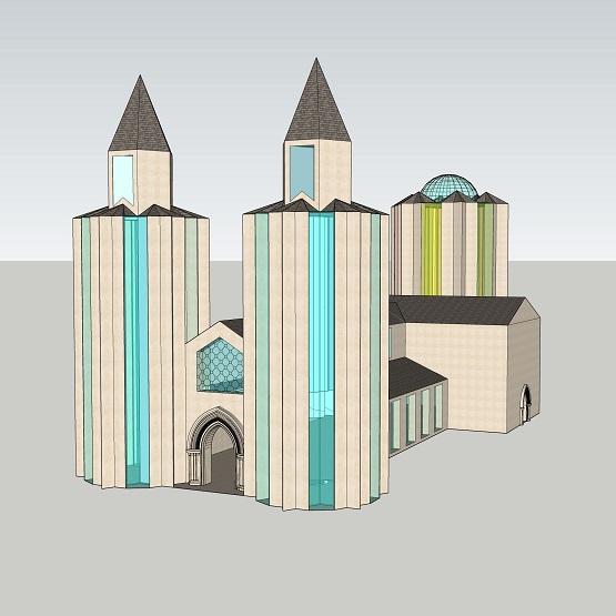
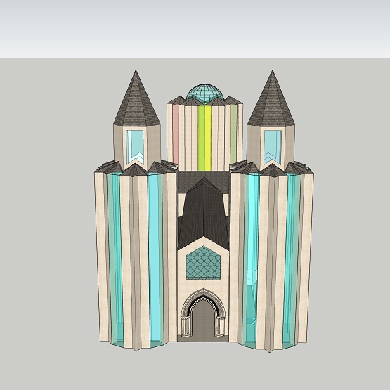
Digital Artwork, SketchUp, 2019.
Mathematically, the project is based on the theory of fractals. A fractal is a mathematical object, which is characterized by self similarity. This means increasing the fractal by a certain factor yields an object that consists of disjoint parts of the original one. The Koch snowflake is an example for a fractal.
The idea behind the project is to use an iteration of the Koch snowflake curve as floor plan of a building. Vectors and gradients should be included in the creation of round windows and pointed arches typical for the Gothic style. Girih tilings are used to create windows typical for churches. The goal is to create an architectural model of a church or cathedral until the end of the project. The project is realized in a manual, architectural sketch of the building. On one hand, the fractal forms represent the apse of the church, on the other hand, they represent two towers on the left and right hand side of the main entrance. The remaining floor plan corresponds to the representation of a typical nave. Subsequently, a 3D realization is created using the software “SketchUp”.
Vektoren verschieben Farben (Vectors shift Colors)
Tessa Schönborn
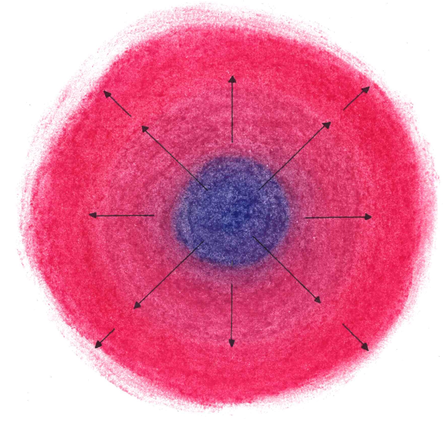
Pastel and watercolor on canvas, 20cm x 20cm each, 2019.
After first considerations, the idea arose to illustrate the mathematical notions divergence and vectors using colors respectively color gradients. Both pastel and watercolor are used in the paintings. Pastel is well suitable to be spread while watercolor is a good choice to create different shades of color.
The ideas are processed in a total of three paintings. The first and the third painting shall illustrate the notion of divergence of a fictive vector field. The first one shows a source. This is supported by the colors, which are arranged in a circle and become darker and darker towards the outside. The third painting shows a sink. Therefore, the colors become darker towards the center. The color shades are substantiated through solitary vectors. The center of the circle represents the origin of a coordinate system. The second picture connects the other two with the summer school. On the left hand side of the painting, the blue tones of the first painting occur, on the right hand side, the red tones of the second painting occur. This represents Paul Klee's thoughts on the balance of warm and cold colors. The blue and the pink tones get brighter towards the center. Vectors support this gradient.
Here, the notions of a vector and of the passive line (notion by Paul Klee) shall be visualized. The darker color pigments are moved inwards by the arrows and lose intensity along the way. The topic of the course and the place of origin of the paintings are placed in the middle to refer to the course.
Beton 4 (Concrete 4)
Samantha Dorothea Waiden
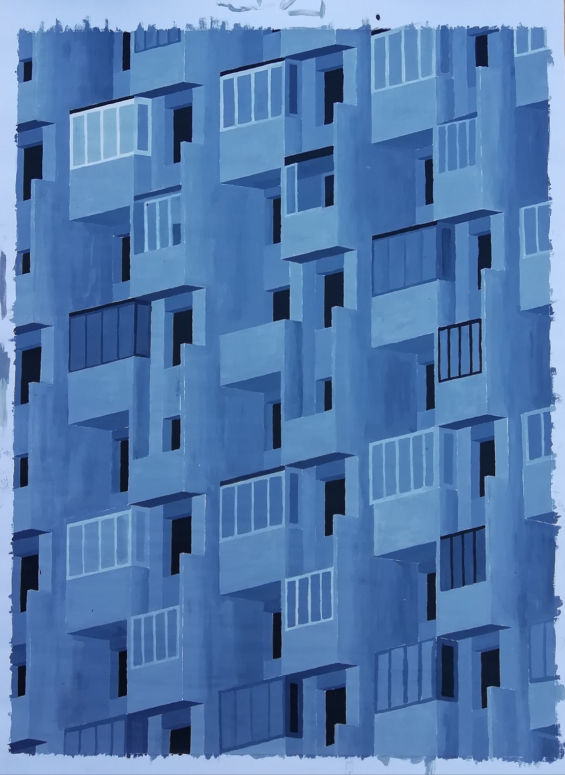
Acrylic on paper, 84cm x 62.4, 2019.
The 84✕62,4 cm acrylic painting represents the facade of an apartment block in a slightly reduced form. In order to reproduce the structure of the building as regularly and precisely as possible, the side lengths of a smaller preliminary sketch were placed in their relations to maintain the proportions at a larger scale. The building was constructed using parallel perspective, which is also used to represent three-dimensional objects in coordinate systems. The connection to mathematics is in the precise way of working and in the representation of structure. The project also picks up Paul Klee's theory of uniform weight distribution through the regular composition of light and dark surfaces.
Rotation 1-2
Niklas Steeger
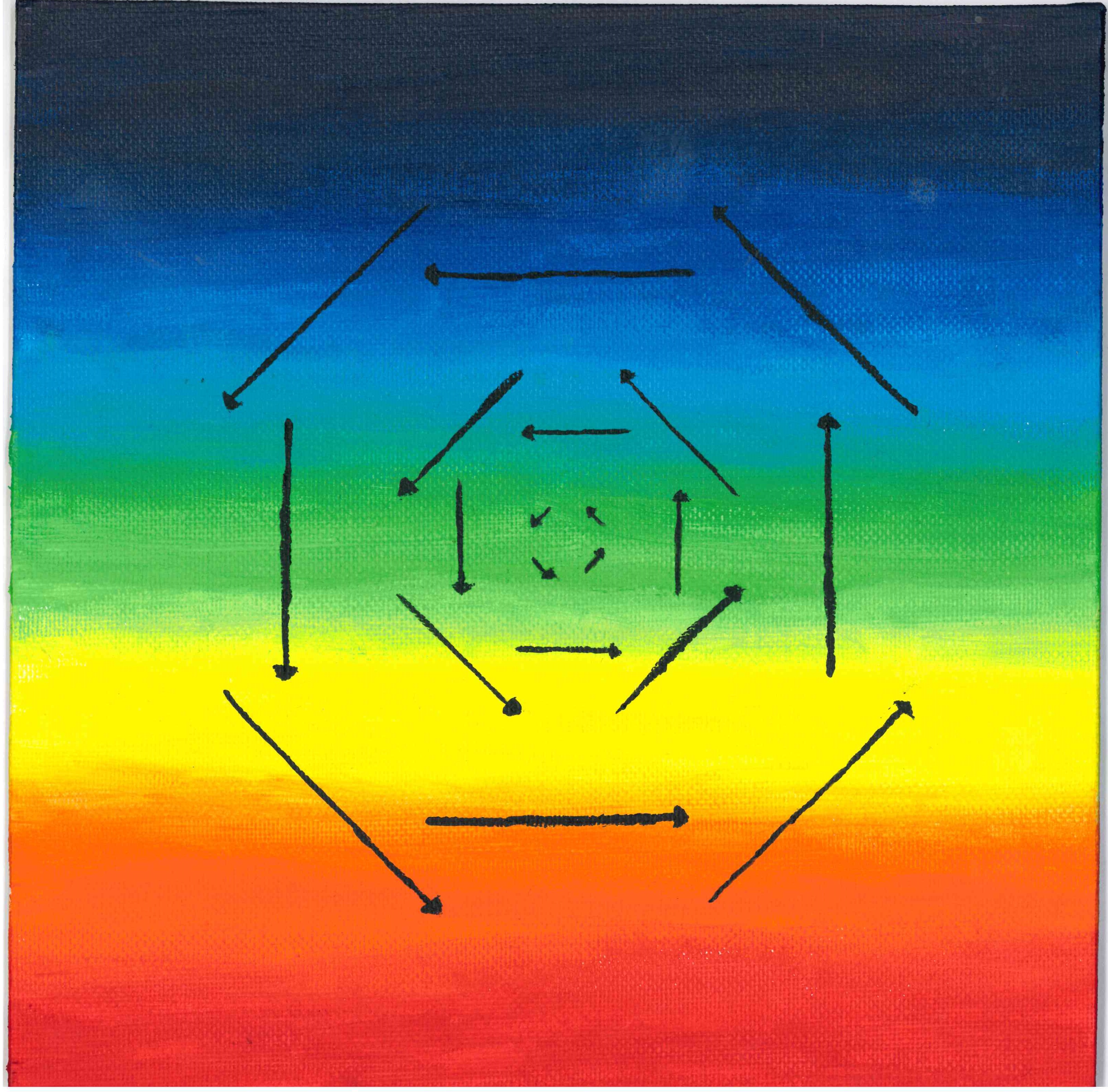
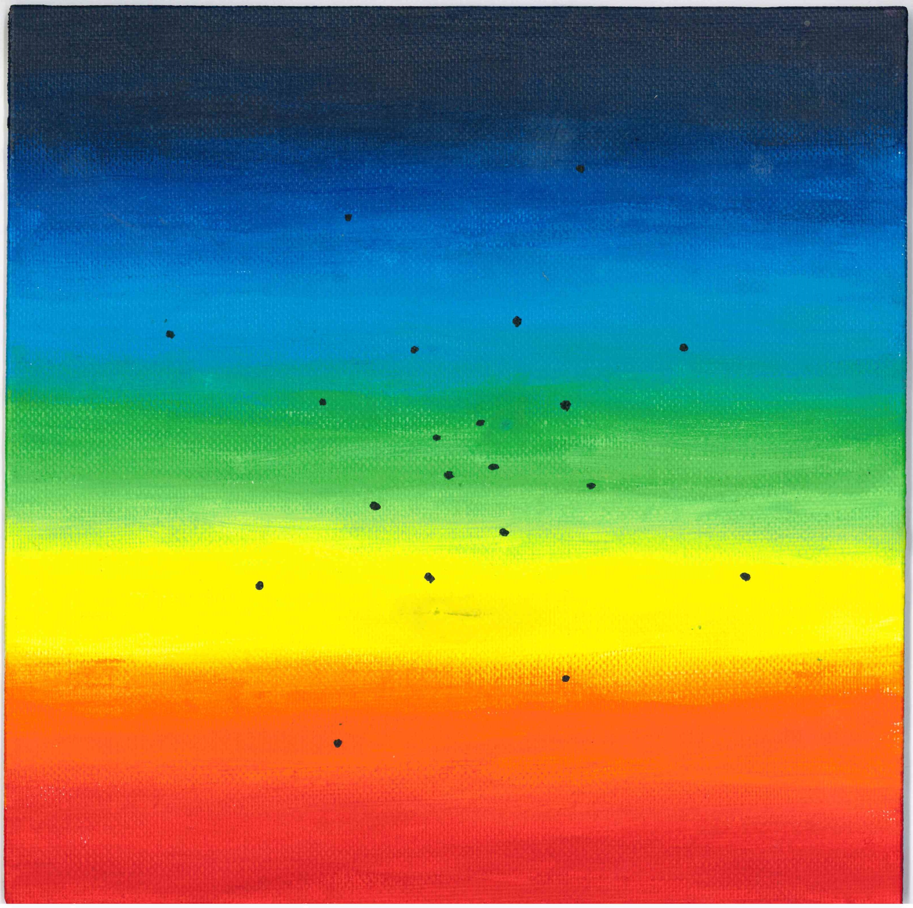
Acrylic on canvas, 20cm x 20cm, 2019.
For the project, two square canvases with a side length of 20 cm each were used. Acrylic paints were painted on them. The background is designed with a color gradient in which each individual color is equally weighted. This is an allusion to the second chapter of Paul Klee's sketchbook: In it, he explains that according to his philosophy, every color should be equally distributed. In addition, the used colors reflect the visual range of humans and are also arranged according to their corresponding wavelength.
The left image represents the simplified version of a rotation within a vector space. Here, one can imagine a coordinate system that has the zero point in the center of the image. Thus, all arrows rotate around this point. The further the arrows move away from the zero point, the longer they become. So the arrows parallel to the x1 or x2 axis are as long as they are distant from the zero point. The second image of the same size has the same gradient. This symbolizes the connection of both images. In addition, it can be seen that the points drawn in, if they are also drawn in the same coordinate system, have the same coordinates as the arrowheads from the other image. Furthermore, both images can be arranged next to each other independently of the side, as long as red or purple are on top, as neither the symmetry nor the gradient is destroyed by this rotation.
Fibonacci-Folge (Fibonacci-Sequence)
Niklas Steeger
Acrylic on paper, 21cm x 21cm, 2019.
The picture was painted on square paper with a side length of 21 cm. In the middle is a square with a side length of 13 cm, which is composed of other squares with side lengths of 1 cm, 2 cm, 3 cm, 5 cm or 8 cm. Each of these individual squares is painted with either pink, blue, yellow, white, or green acrylic paint. It is also easy to see that all side lengths of all squares are composed of the Fibonacci sequence. In addition, the square, which is 13 cm✕13 cm, contains 34 squares, where the number 34 is also a member of the Fibonacci sequence.
Noch kein Titel (No Title Yet)
Isabell Can

Acrylic on canvas, 30cm x 40cm, 2019.
The project “No title” is an interpretation of the Pythagoras tree, which is a form of a fractal. Fractals represent geometric patterns that describe certain natural or artificial patterns. The picture was painted with acrylic paint on a thin canvas. The background is black and the Pythagoras tree is gray and white. The design was chosen to emphasize Pythagoras' characteristic triangle with dark areas, as these stand out next to the light squares. The connection between art and mathematics is strengthened by the artistic abstract design of the tree on the one hand and the emphasis on mathematics on the other.
Es dreht sich. (It is spinning.)
Charlotte Arens, Annika Seidel
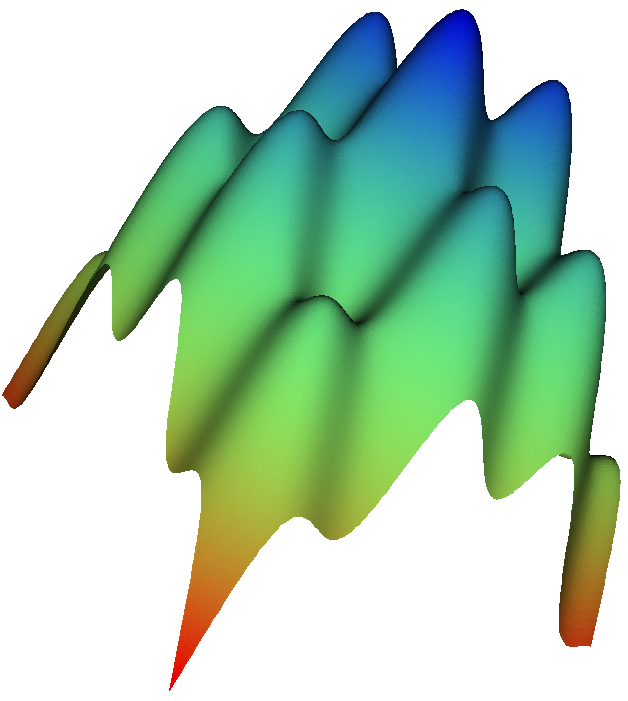
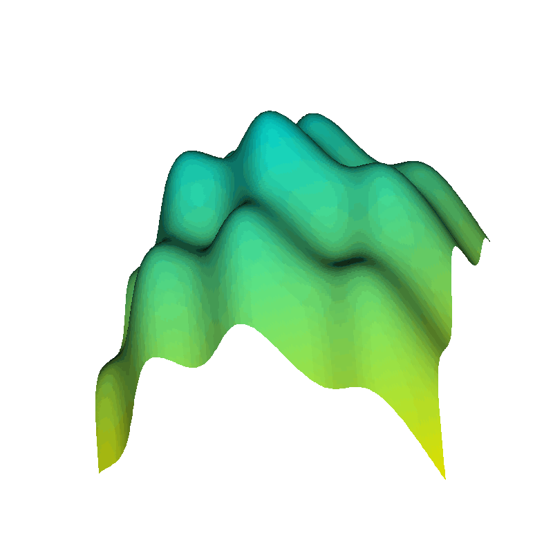
Digital artwork, JavaView, 2019.
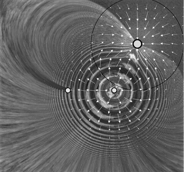
For the project, first, the plan was developed to create an animation showing the extension of a scalar field by a mass. This animation should start with a gradient field where the value at the beginning is 0. When a ball now hits the gradient field, an elongation should be shown. Depending on where the ball hits the field, the expansion should be at a different location. This animation should be based on the space-time representation. Despite the neglect of the physical component, it was finally decided that this project could not be realized in the remaining time with the little previous knowledge. With the idea to realize the project in 2D, the animation also distanced itself more and more from the course content.
For this combination of mathematics and art, a three-dimensional image of a scalar field was finally created with the software “JavaView”. This is a program with which it is possible to display mathematical structures graphically. For the creation of the scalar field, several steps were necessary. By using a template, the workload was reduced. First, a discrete vector field was created. For this, any function that assigns a vector in R3 to each point (x1, x2)∈R2 could be used. Here, it was possible to regulate the number of vectors in a fixed interval. To make the later scalar field in the figure appear as smooth as possible, the number of vectors was increased to ten times [the original number].
In the source code, the function equation can be changed at will to create different functions. In the figure the equation (x1, x2, x12+x22+sin(x1)+sin(x2)) is graphically displayed. To create the gradient, the average height of each element of the discrete scalar field was calculated. This height was then assigned a color value consisting of blue, green, and red parameters. Within the program “JavaView” it is possible to rotate the function graph. So it was possible to create an animation. This was decisive for the choice of name.
Surrounder
Laura Blechschmidt, Elias Dincher, Raphael Mergehenn, Lukas Schicht, Martin Widany
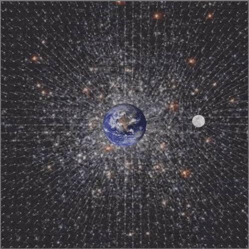
Digital artwork, CindyJS, 2019.
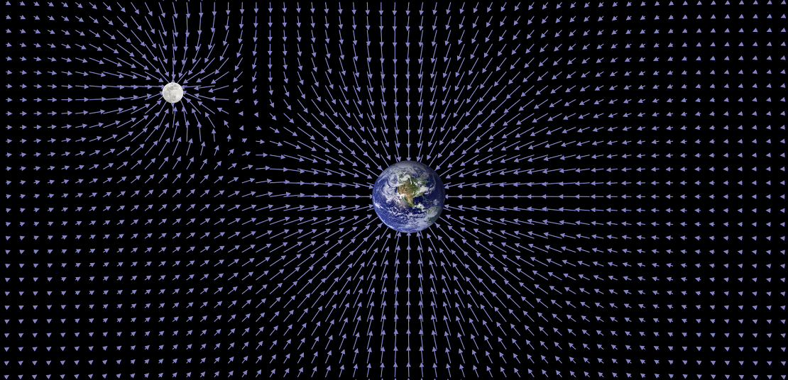
The projects on the topic of the course should include both mathematical and artistic aspects. This project will also be supplemented by a physical component. The goal is to visualize the time-varying gravitational field of the Earth-Moon system.
Realization
The first step is to find a suitable programming language to implement the idea. The CindyJS framework, which is based on JavaScript, is chosen. Projects on the website of the programming language serve as inspiration. Since none of the participants in the project has any previous knowledge of JavaScript or CindyJS, an understanding of the syntax will be acquired first. A simulation of the electrostatic field between two point charges [available in CindyJS] serves as a basis for the next steps. An understanding of the language is acquired by selectively changing, adding or deleting parts of the code.
The analysis of another [CindyJS example] program, the animation of an analog clock, allows the representation of the rotation of a point (moon) around a fixed point (earth). To do this, the background is changed, the hour and minute clockhands are removed and a larger point is placed at the tip of the second clockhand, which now rotates once around the center in one minute with small jumps. In order to make the animation for the project more fluid, the function for the rotation is adjusted. To realize the other part of the project, the animation of the gravitational field, the simulation of the electrostatic field [also included as example in CindyJS] will be adjusted so that a resulting vector field for the two points is generated and visualized.
The result
To complete the project, the two modified sub-programs are combined and images of the Earth and Moon are inserted to enhance the vividness. The finished animation shows our planet in the center, which is regularly orbited by its satellite. In the background a vector field is shown, which adapts to the circular orbit. The vector arrows show the strength and direction of the added gravitational field of the two celestial bodies. When looking at the animation more closely, it can be seen that the weight forces balance each other at some points. In addition, it can be seen that the gravitational field of the earth is stronger than that of the moon. The reason for this is that the mass of the planet is the greater, which is why it is also shown larger.